

Wonderfud: bilingual B2B WordPress site with motion · Case study
B2B · Bilingual WordPress site · Sep – Oct 2026
Wonderfud connects Peruvian wellness ingredients and products with brands in other markets. I turned their design into a bilingual site their team edits on their own, with a signature motion that makes the brand memorable.
From a Figma prototype to a WordPress site that’s manageable end to end, in two weeks and with two review rounds with the client.
The starting point: A visual prototype with a lot of personality.
Wonderfud came in with Figma screens: the home page on desktop and mobile, plus a few inner pages. The challenge was to turn them into a real, bilingual, editable site without losing the design’s energy, and to define what the prototype didn’t cover: the missing screens, mobile behavior and motion.
What we agreed to build
- True to the design Every page exactly as approved, at any screen width.
- Safe to edit The team changes copy, photos and products without being able to break the design.
- Two languages English for international buyers and Spanish for the local market.
The system: From prototype to design system.
I organized the Figma file into components and tokens: a brand palette, a type scale and a fluid width, so every new page comes out of the same system.
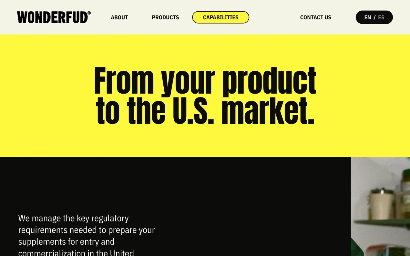
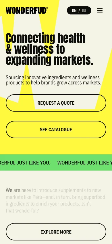
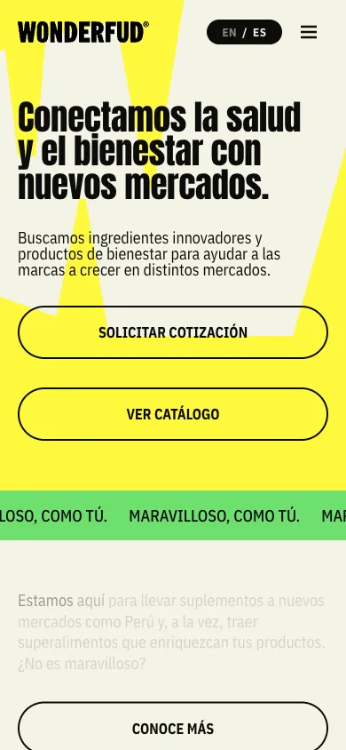
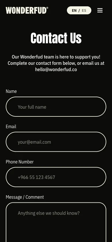
The mobile version is its own layer, not a scaled-down copy: spacing, type, images and menu designed for the phone.
The motion: A brand that moves the way it speaks.
The prototype didn’t define motion, so I proposed a language of its own with four brand gestures. The most visible one: the W on the home page paints itself like a brushstroke on load.
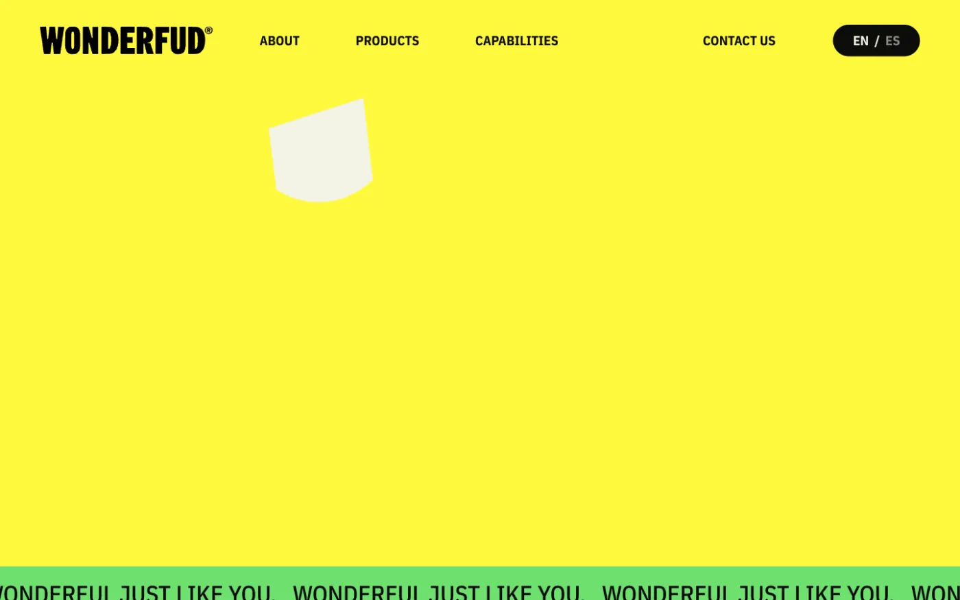
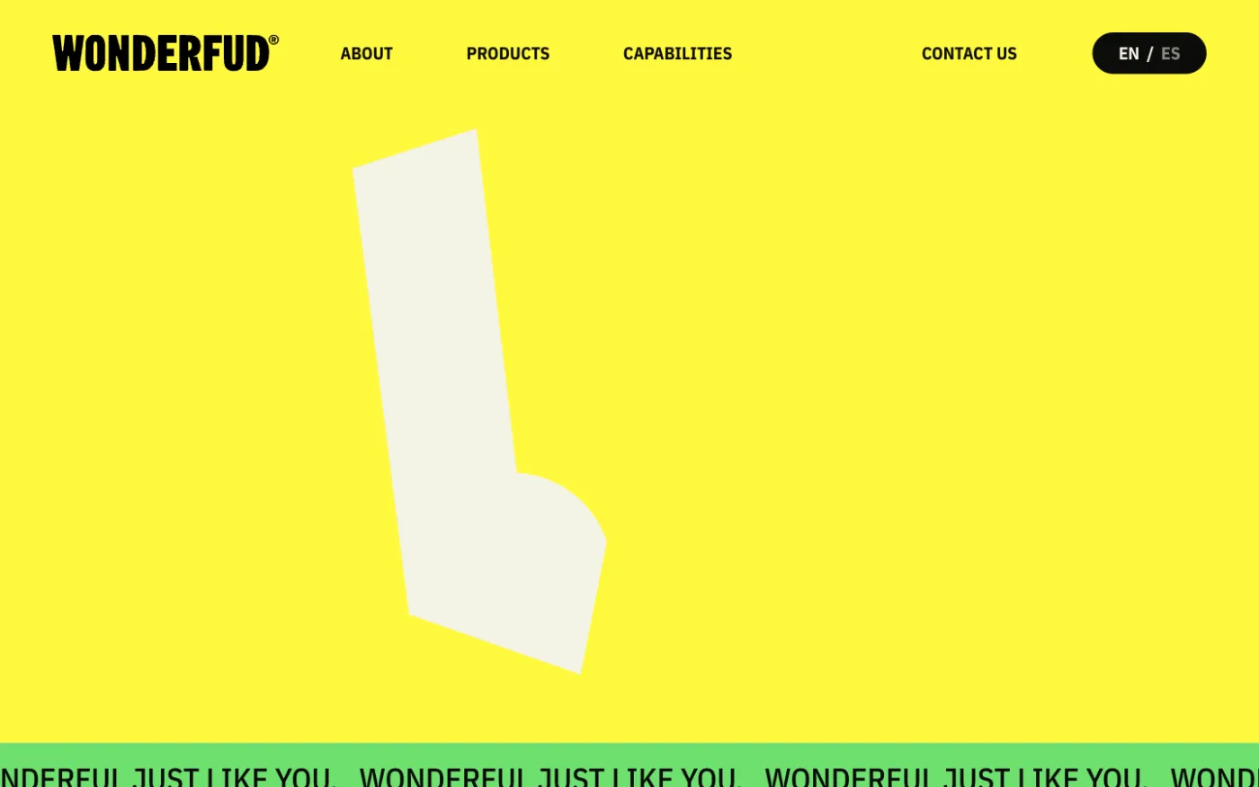
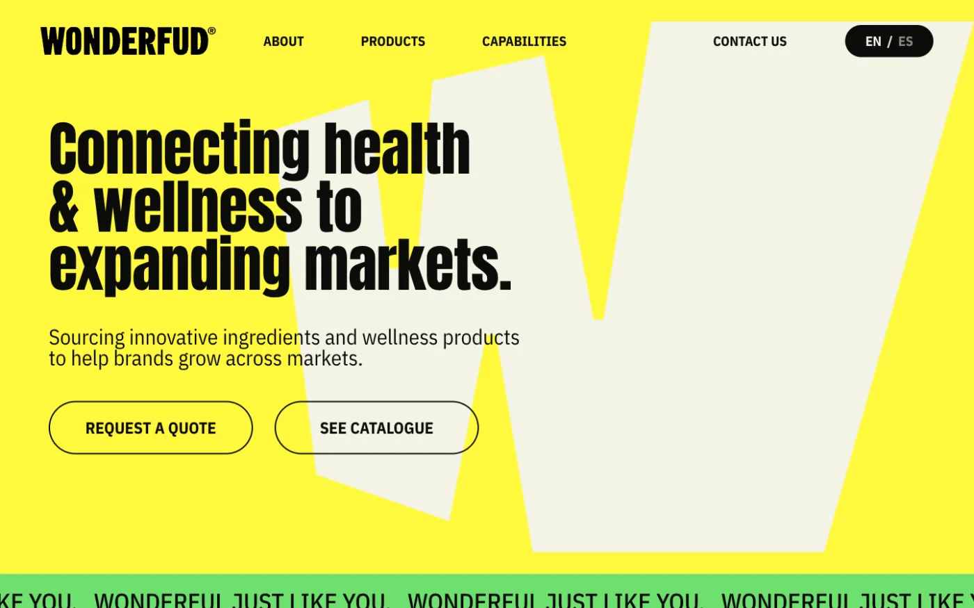
- Scroll-driven Sections stack and reveal themselves at the pace of reading.
- A choreography per screen Desktop and mobile each have their own sequence.
- Considerate If the visitor asks for reduced motion, the site respects it; it can also be turned off from the panel.
The panel: Everything editable, nothing that can break.
- What I saw: The team needed to update the site without a developer. What I did: Each page with its own fields and a toggle to show or hide every section. (10 — editable content groups)
- What I saw: Every ingredient had to be shareable with a buyer. What I did: Supplements and raw materials as a catalog, each with its own URL, gallery, attributes and related items. (1 URL — per product)
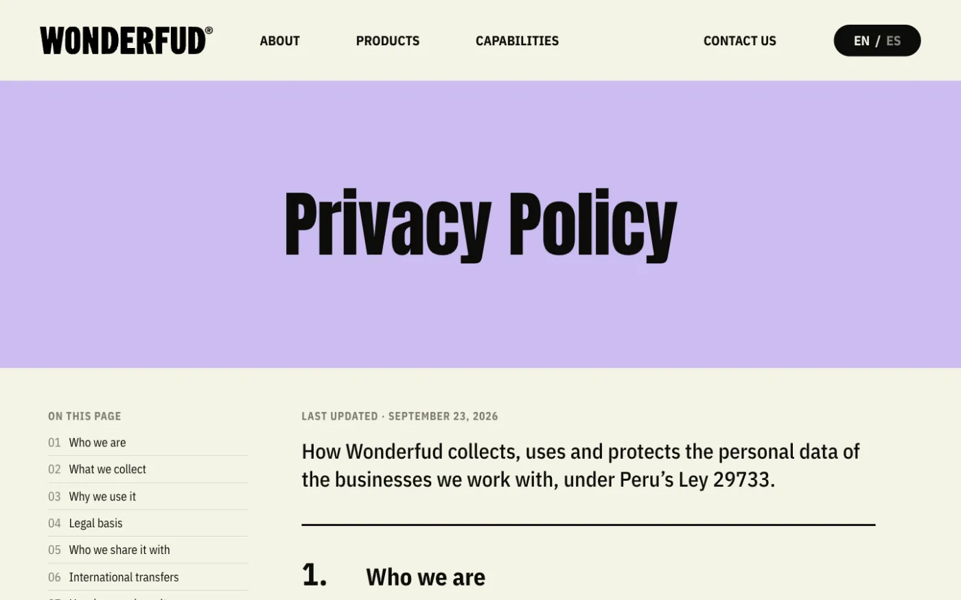
- What I saw: Buyers come from several markets. What I did: A site in English and Spanish, with its own content in each language, not just a translation. (2 — languages from a single panel)
Every change goes through automated review and lands in QA first; content migrations apply themselves, with a backup taken beforehand.
Technologies: What I built the site with.
- CMS: WordPress, ACF, WPML
- Frontend: HTML, CSS, JavaScript, GSAP
- Delivery: Docker, GitHub Actions, Redis, Cloudflare
- Design: Figma
The result: A bilingual site, true to the design, that the Wonderfud team edits without fear of breaking it.
- 2 — languages with their own content
- 17 — pages and product sheets
- 10 — editable content groups
- 2 — weeks, with two review rounds